Whether designing a home, school, or healing environment, color is about much more than looking pretty—it can make or break the success of a space.
Color affects the brain and nervous system, and different colors can make the body feel different ways and elicit different feelings.
Hunter Pattershall, a designer at Studio G, first started researching color theory when they were a student at Wentworth Institute of Technology. Hunter was working on the redesign of a women’s shelter teen center and was tasked with looking into how to use color to help “teens with trauma and hard backgrounds,” they said.
“At a base level, people know color but don’t really understand why it does what it does,” Hunter said.
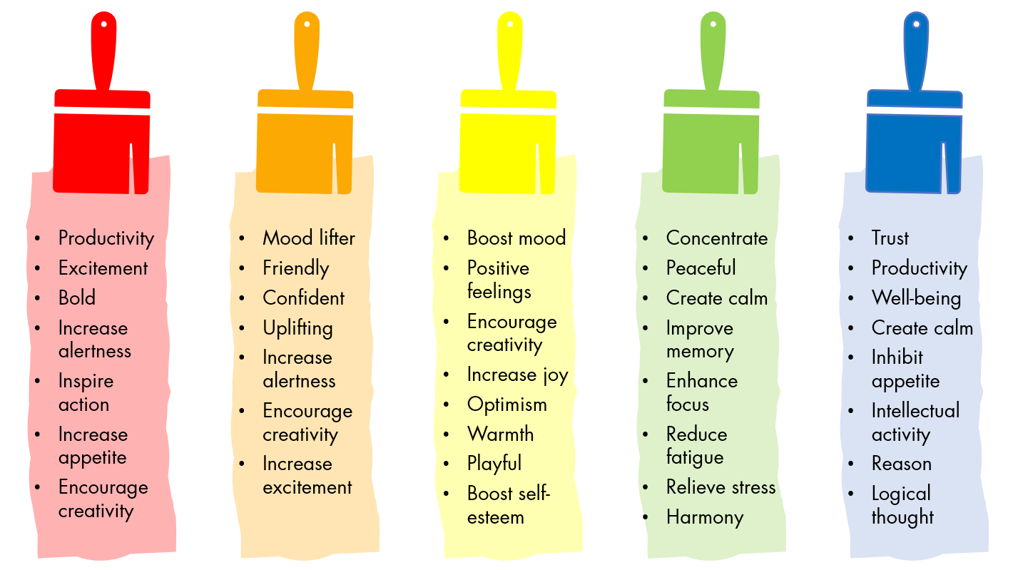
They said that color needs to be understood “from an emotional level,” and each person responds to color in their own way. Generally, blues and greens create a calm environment and lead to feelings of comfort and happiness, while reds can be stimulating. Yellow is generally thought of as a happy color, but for some, it can elicit feelings of sadness.
How does our brain process color & affect our emotions?
When a colored object is struck by light, it absorbs the wavelengths that are the same as its own atomic structure, and the rest is reflected to the person looking at the object. These reflected light wavelengths hit the eye and become electrical impulses.
Hunter explained that “your eyes are always working,” and after they pick up color “the electrical impulses have to be transferred somewhere.”
That “somewhere” is the primary visual cortex in the back of the brain. But to get there the electrical impulses travel though the limbic system, which is responsible for emotional and behavioral response, generating reactions before we know what color we are observing. “So before you even interpret what you’re seeing, you’re feeling what you’re seeing and responding on an emotional level,” Hunter said.
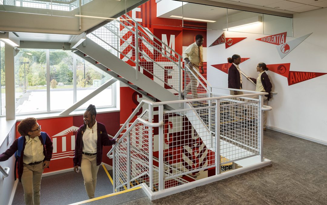
Color & Learning
When it comes to educational settings, younger children tend to lean more towards bright colors, but can easily become overstimulated if the colors are not used correctly.
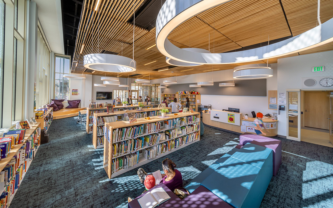
It is recommended that for preschool children ages three to six, lighter versions of pink, yellow, or peach be used in place of bright reds and yellows. Elementary school-aged children learn best in environments with greens, beiges, and blues. In high schools, soft colors like light green, green-blue, and beige are good choices.
“A visual design has two functions: One is to support learners to process materials cognitively, and the other is to influence learners’ attitude and motivation effectively.”
– Moreno, 2007; Plass, Heidig, Hayward, Homer, & Um, 2014 as cited in Chang, Xu, and Watt, 2018
Colors with low wavelengths help create calming environments that make it easier to focus. In general, greens are calming, but when used incorrectly (wrong shade or wavelength) they can have a detrimental effect, leading to feelings of blandness or demoralization, or even be as overstimulating as some reds.
Though the use of color is important and often deliberate, color is “just a tool,” and not a doctrine, Hunter said.
Color should not be an afterthought
Typology, program, size, and budget also drive the application of color in projects. Smaller projects or those with tighter budgets may require creative or selective color utilization in low-maintenance, budget friendly finishes. The earlier color is incorporated into a design, the better. “Where you can, put in a little bit of color,” and “leave enough space for the user to add their own color,” said Hunter.
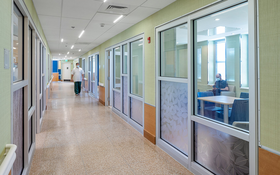
Color can also be brought in from the outdoors through neutral colored tile or wood. The renovation design of the Men’s Recovery from Addiction Program Units at Taunton State Hospital utilized the outdoors and biophilic approach to the finish selection. The natural colors, materials, and references to elements found in nature contribute to patient healing.
When thinking about color for housing, Hunter said it’s “more like a blank page,” while in an educational setting, “it’s more creating a framework.”
For schools, they suggested that a designer incorporate school colors, which are often bright and stimulating, in “small doses,” such as a more active space where a “branding spot” can be created.

“If you’re wanting to add color to something, think about where that desire is coming from,” they said. “What is the space needing, missing—sometimes color is not the answer. It sometimes means it needs to be designed in a different way.”
Hunter said that the absence of color “can also be as detrimental as too much,” and it’s important to think about how color affects different people in different ways.
In the end, it comes down to using color mindfully.
